Magnetic field of the Earth
Ever seen a diagram of the geomagnetic field that looks something like this?
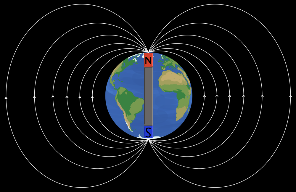
Some search engine is going to scrape this and show it as an ordinary result, but that’s on anyone who (re)uses it without consulting the source. I’m almost tempted to CC0[1] it for maximum chaos.
While I might technically be exaggerating, every deficiency of this diagram is something I have legitimately seen on the world wide web. In summary:
Field lines converge at poles
Those poles are the geographic poles
Field emanates from pole marked ‘S’ and converges at ‘N’
Field is parallel to surface without intersection
There is a bar magnet (sometimes even explicitly labelled as such)
So just to be clear, none of that is true. The field is primarily dipolar, but bar magnets are absolutely not dipoles – they’re far too long.
This proliferation of perfidious pictures leaves only once course of action: do it myself. But properly.
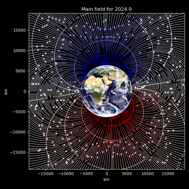
I don’t just mean superimposing a dipolar field on top of a terrestrial basemap. I mean a sophisticated, quantified diagram based on the most recent worldwide geomagnetic observations, compromising not even on the orientation of the planet underneath.
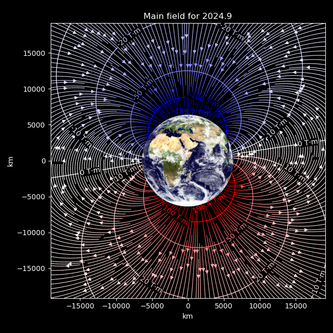
This hopefully stands on its own but there are some additional points to clarify that don’t fit into figure form. First and foremost, this is derived from the 14th edition of the International Geomagnetic Reference Field, which models the large-scale, relatively static field originating from sources inside the Earth. I personally operate a total of zero high-precision geomagnetic observatories, so it’s mighty convenient that people who do, assemble their measurements into a unified model from 1900 into the near future, and publish its coefficients on the internet. ‘Relatively static’ here means variations over a year rather than much smaller fluctuations over a day.
A somewhat unconvential addition I’ve made is the inclusion of potential contours, which are the labelled lines that cut across the arrow-bearing field lines. This is mostly to provide a representation of the strength of the field: the average intensity along a path is the difference in potential at its ends divided by its length, so the field is stronger where two contours get closer, and the contour labels together with the axis scale quantify that strength. The lines are also shaded by potential, so faster colour changes denote a stronger field. In this sense it’s apparent that the field is weaker away from the surface, as the colour is generally white with small gradients.
The points with the highest and lowest potential are labelled with their potential, and correspond to the magnetic dip poles – locations on the surface where the field is directly vertical, and where you would end up if following a compass endlessly. In fact the view of the Earth, centred north of Madagascar, is calculated precisely to make these dip poles appear at the horizon and in the plane of the plotted field. The poles just happen to be at roughly the same longitude at the present time, which makes this viewpoint rather lacklustre. Since these potentials are roughly ±200 T·m, and a trip around the Earth is about 20000 km, it follows that the average horizontal intensity at the surface is about .
Of course, the magnetic field does exist beneath the ground. To see it, we need to go deeper:
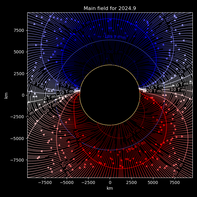
The faint blue circle is the familiar Earth. The orange circle is roughly the core-mantle boundary, with a 3485 km radius.
This field is even less dipolar, seen particularly with the elongation of the 100 T·m contour, and how the two ‘poles’ are substantially misaligned. Don’t take this too seriously, though – the IGRF, like many geomagnetic models, is a gradient of a scalar potential, which makes it only meaningful in regions without bulk movement of electrical charge.[2] And unfortunately for such models, the base of the mantle becomes increasingly convective and conductive with temperature, down to the outer core which is a freely-flowing and conducting liquid metal. Modeling a magnetic field in these conditions gets into magnetohydrodynamics, a famously straightforward combination of Navier-Stokes’s linear simplicity and Maxwell’s uncoupled independence.[3]
Naturally a potential gradient couldn’t illuminate the interior of such an environment, but the IGRF basis functions don’t actually have a physical boundary, so… we’re educationally obliged to go deeper:
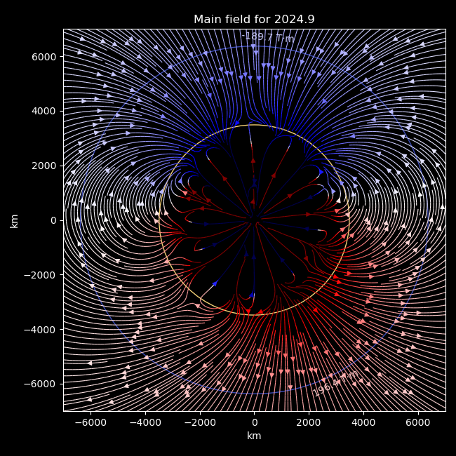
So, just to stress, this isn’t accurate. Mathematically the IGRF extends down to the centre of the Earth, but the physical relevance in this region is nonexistant. Regardless, I find it interesting that it doesn’t just become irrelevant, but actually breaks down below the mantle. The model is in essence an interpolation of ground-level and orbital measurements with no explicit acknowledgement of the outer core, yet still seems to indicate that something happens at that depth. Pretty nifty.
I actually put the software behind this together at the end of October, as a follow-up to the surface-level magnetic fieldlines. Compared to that post, I had to write a moderate amount of code in order to calculate magnetic potentials and to make everything work beyond the surface, as well as being side-tracked by things that led to other posts and something more relevant that might become another follow-up.
The IGRF is developed and published in five-year intervals to track unpredictable variations in the main field, and at the time I was working with values extrapolated almost five years from the publication of the then-newest 13th edition. So as someone sadly lacking a global network of magnetic satellites and observatories of my own, I figured I might as well sit on this until the next edition was available, so I could present a diagram with almost-state-of-the-art accuracy. It turns out that IGRF-14 was published about a month later, on 19 November, but I didn’t realise that until now. This page still shows IGRF-13 as the latest, for example.
Well, here in the future, just what sort of difference does a modern model versus a five-year-extrapolated one make?
Main field for the same date as above, according to IGRF-13
Okay, so when flicking directly between the IGRF-13 and IGRF-14 versions, the most apparent difference is just that some of the lines are truncated differently, which says little about the field itself. But actually, it can be seen that the northern dip pole changed from −189.9 T·m to −189.7 T·m, and the southern dip pole from 196.6 T·m to 196.4 T·m! So, in essence, zero substantial change to the shape of the field but something like a 0.08% reduction in field magnitude between the models. It’s all educational.