Geodesy

The small-circle equidistant projection

It’s a simple fact of life that everyone loves the azimuthal equidistant projection, which shows the world at the correct distance and direction from its central point, even those who have never seen the term in their life.

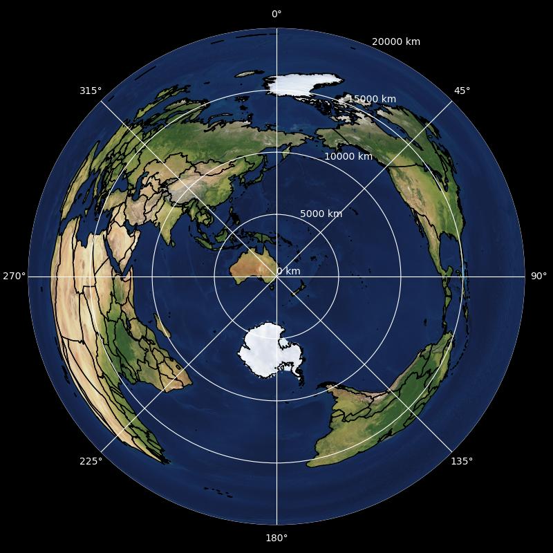
For example, when centred on Sydney:

Azimuthal equidistant map centred on south-eastern Australia, showing the world in rings up to 20000 km away

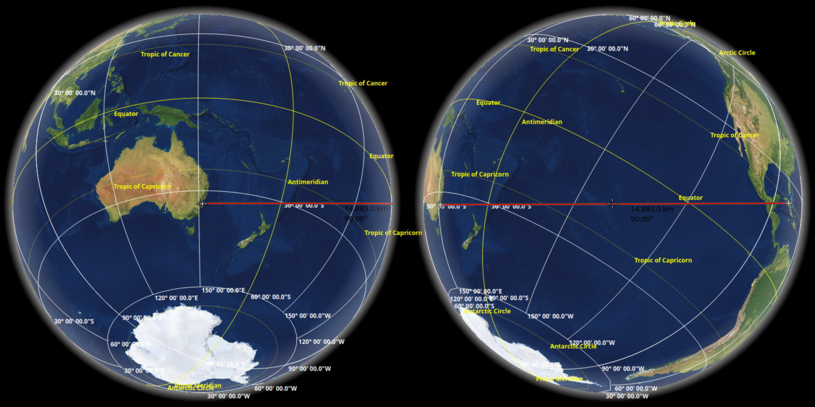
One particular point of interest is that Cuba is shown east of Sydney, despite being in opposite hemispheres. And while this is literally true…

A geodesic running from south-eastern Australia at a 90° bearing, ending in Cuba 14883 km later

It doesn’t do much to affirm ill-conceived views of the world perpetuated by cylindrical and pseudocylindrical maps. Wouldn’t it be nice to use terrible metrics for ‘distance’ and ‘direction …

More…

Alternatives to the ‘Antarctic ice wall’

Everyone loves the azimuthal equidistant projection; some just don’t yet realise it. For that latter camp, a quick refresher: azimuthal equidistant maps show all courses from the centre point at the appropriate angle and with correct scale – a ray from the centre to any point shows the initial bearing and length of the direct route to that point. The azimuthal equidistant projection, which unfortunately lacks a more concise name (‘Postel’?), is quite popular with some rather diverse groups, including the contemporary ‘zero-Gaussian-curvature Earth’[1] crowd. Perhaps more perplexing than this movement’s modern resurgence, is their insistance on the …

More…

Magnetic field of the Earth

One of the labours of Hercules was surely to find a map of Earth’s magnetic field.

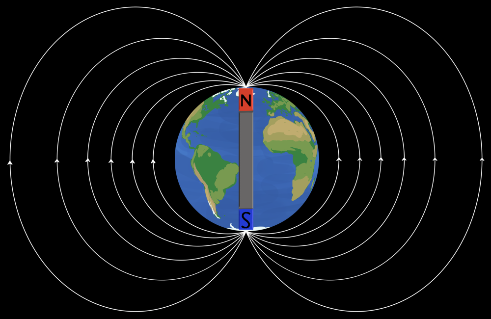
There’s no shortage of crude diagrams of bar magnets superimposed over cartoon globes, and plentiful plots of isogonic lines to be procured from multiple perspectives; yet for accurate depictions of the simple lines of magnetism over Earth’s surface, the offerings seem sorely slack. So just imagine how hard that would have been two thousand years before the internet.

The most common chart I see that has an actual connection to reality, is a map of isogonic lines – contours of equal magnetic …

More…